BRAND ARCHITECTURE

DATE: 2016 – 2019

SEED is a brand that was constructed for a startup cold-pressed juice company launching into the health & beverage sector in South Africa.

Their long-term goal was to develop into a wholesome, feel-good, lifestyle brand with the potential to scale nationally, and then internationally, as the brand grew and extended its product lines.

The immediate brief was to develop a household Juice brand that could become synonymous with the cold pressed juice industry as it emerged & expanded in South Africa.
CONCEPT

FROM SEED, TO BOTTLE, TO YOU.

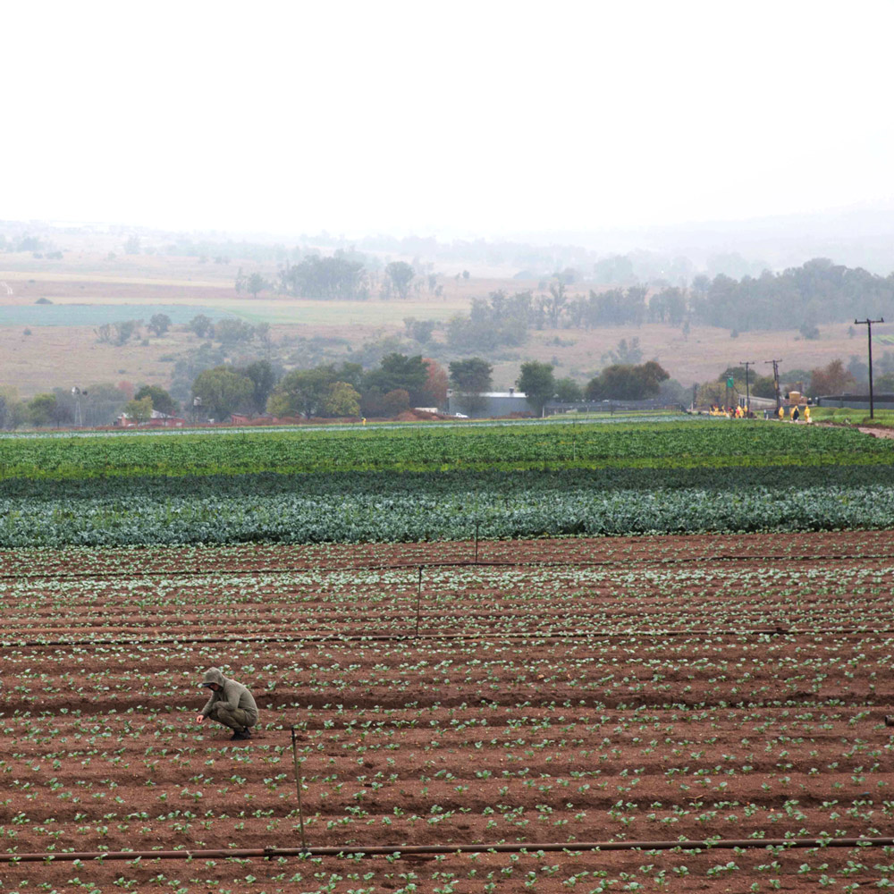
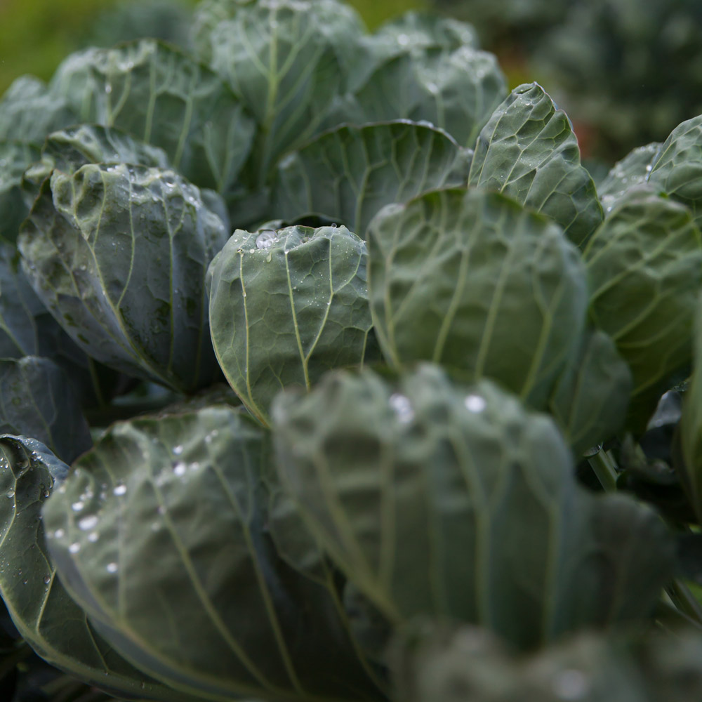
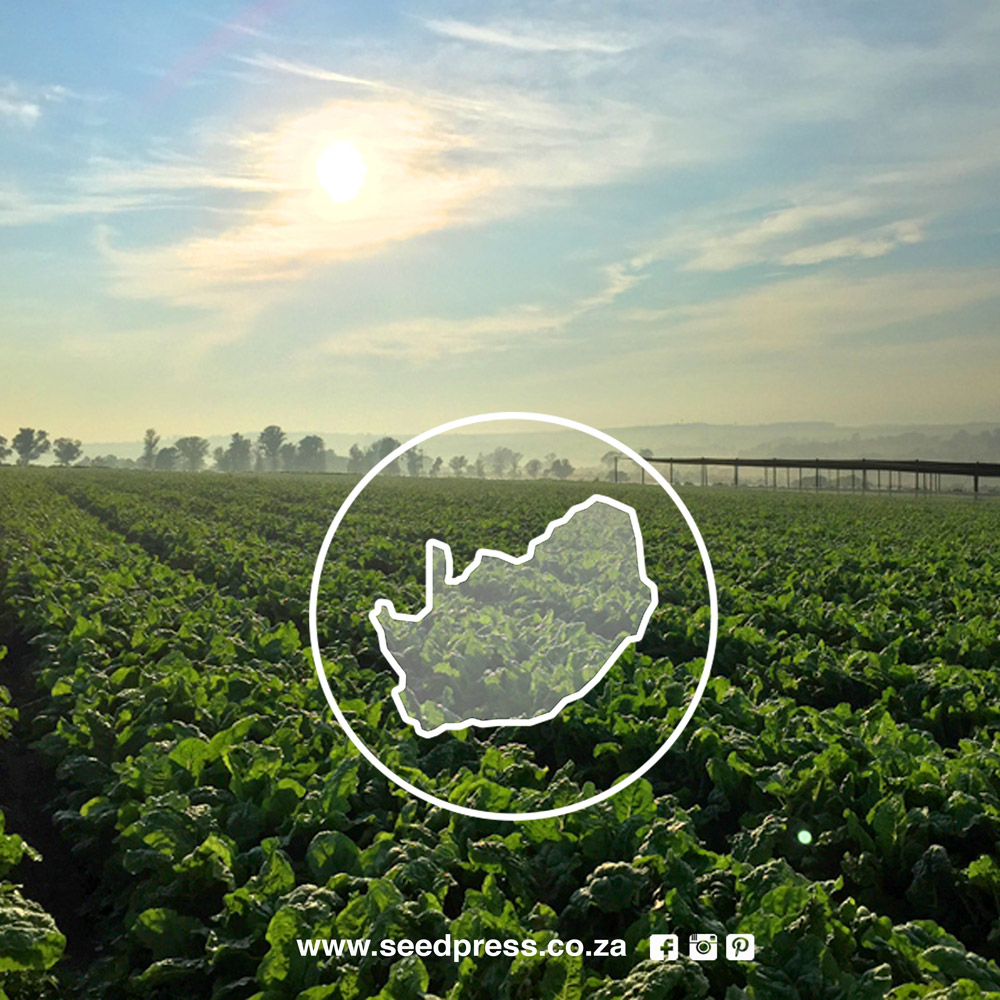
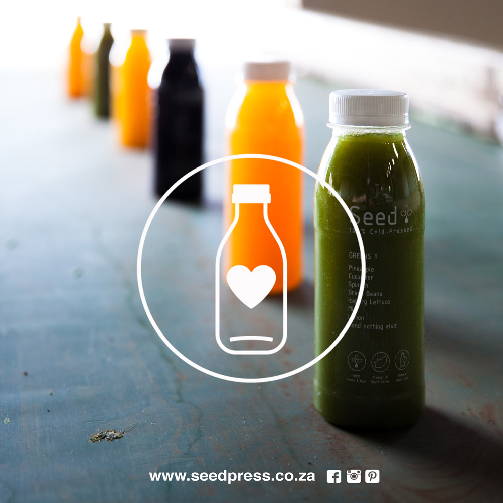
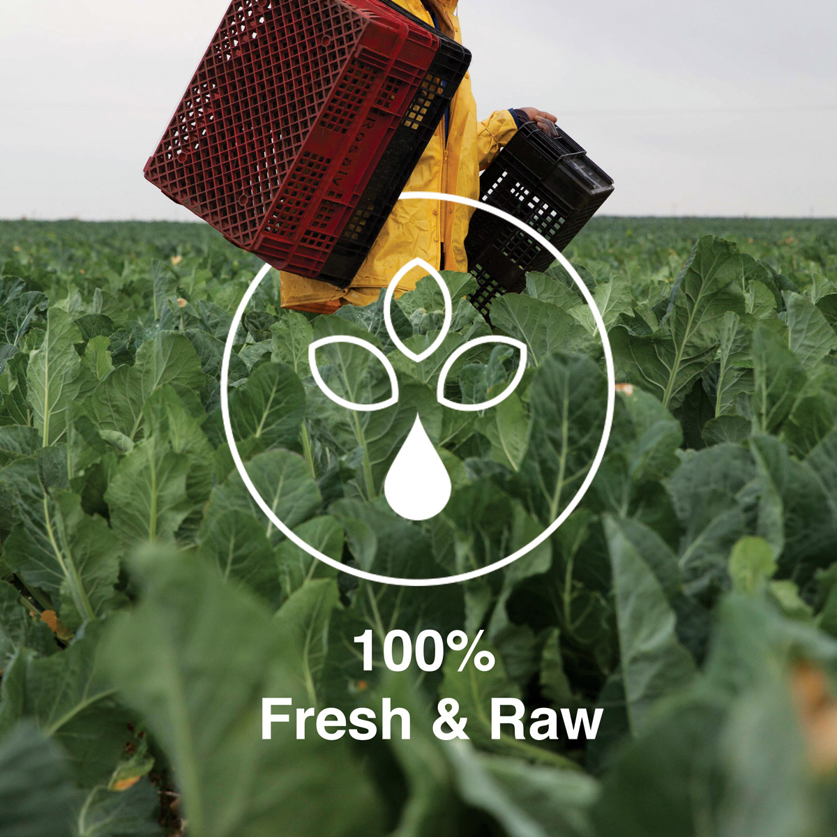
The ingredients for each bottle of juice are grown, hand-picked, pressed and bottled in-house on the client’s farm location in Lanseria, Johannesburg. This turnkey production process was the competitive differentiator and became the core around which the brand concept developed –  telling the consumer the ‘farm-to-door’ story in a powerful, visually captivating way that created a wholesome and honest appeal.

BRANDING

The name, SEED, was a clear way to represent this backstory in every product made, and, symbolically marked the start of this brands journey as it hopefully grew over time.

The font is bold, minimal, easily legible and accompanied by a logo that developed as a graphic interpretation of a flowering seed.

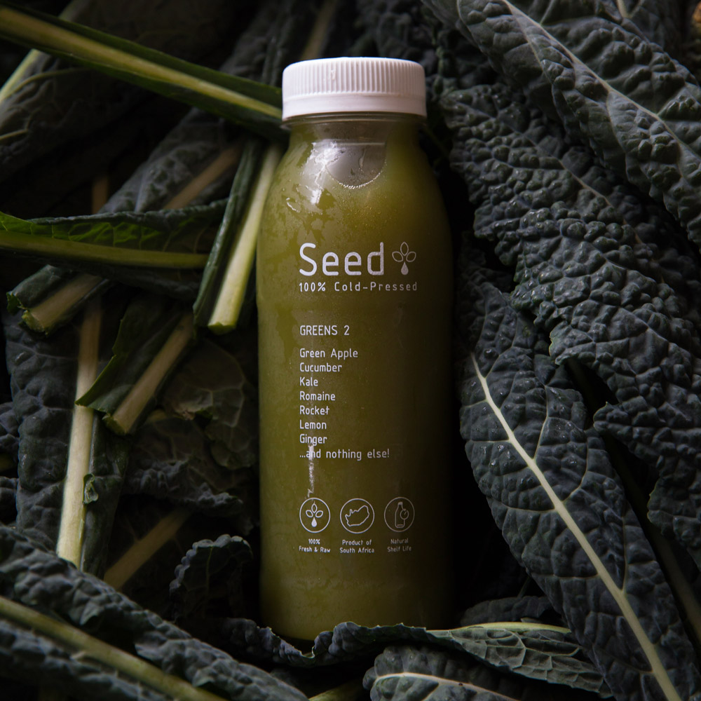
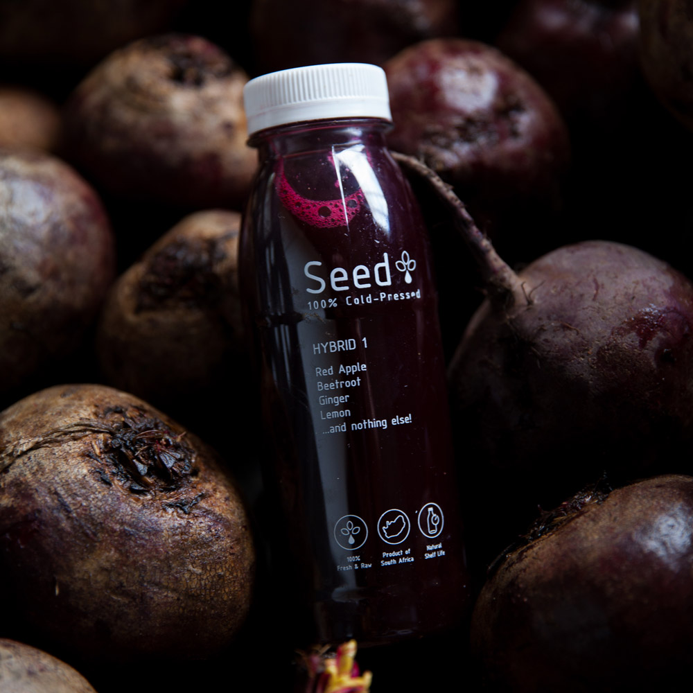
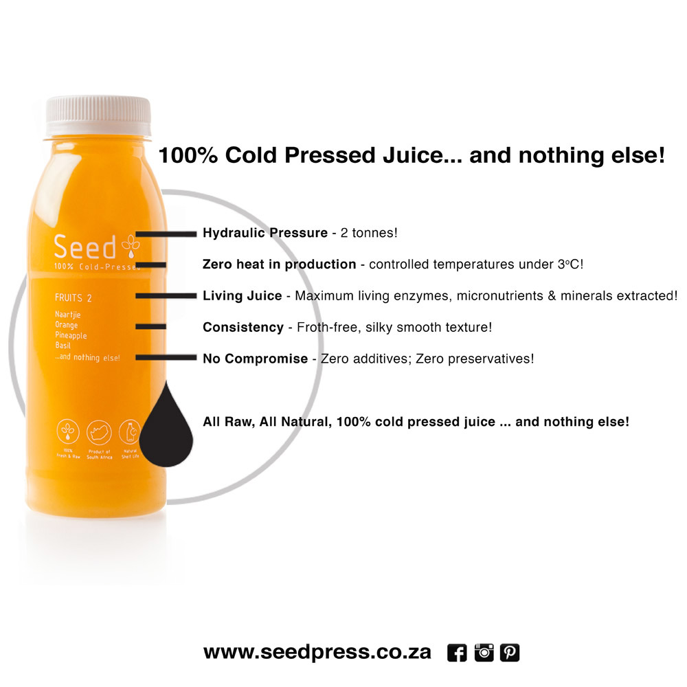
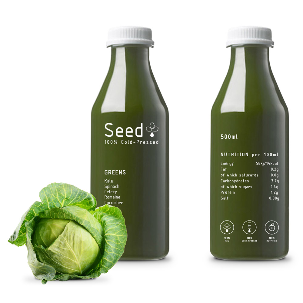
PACKAGING: 100% COLD PRESSED… AND NOTHING ELSE!

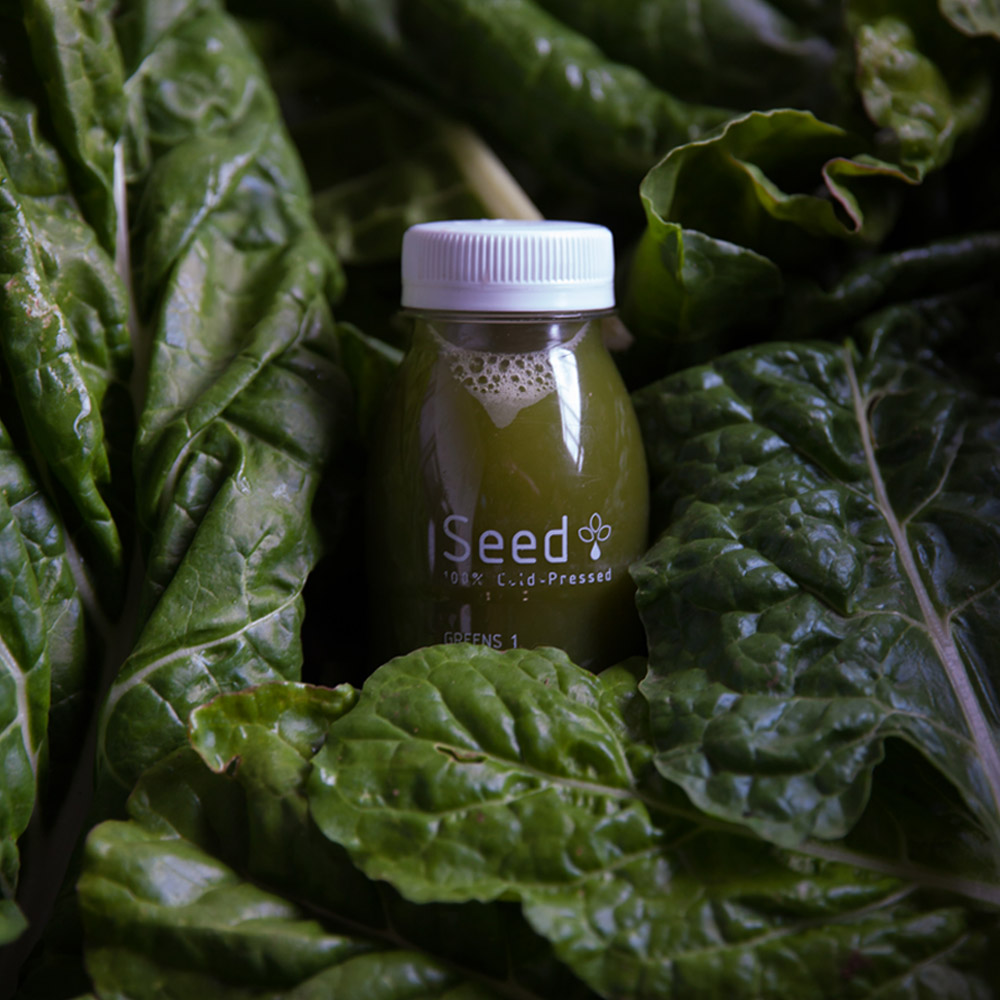
An ergonomic, transparent bottle was selected to highlight the colour of each juice –  the flavor profile becomes immediately recognizable and the transparency emphasizes the list of raw ingredients on the front & the important nutritional information on the back. The packaging design is minimal, easily legible and takes a ‘hide-nothing approach’ – 100% cold Pressed … and nothing else!

INFOGRAPHICS

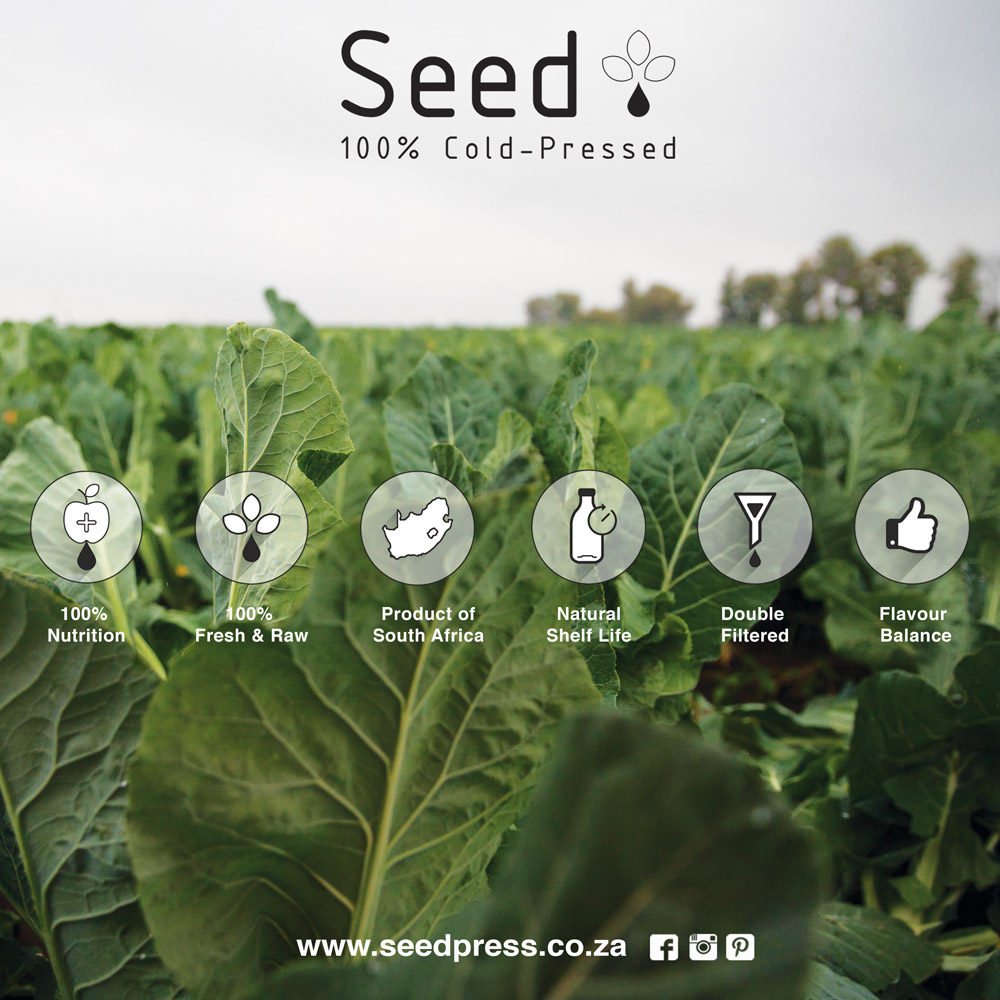
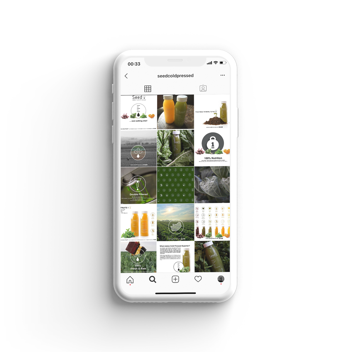
Seed needed to function primarily as a tool to educate the consumer on cold pressed technology, and the associated health benefits over traditional juicing methods. A series of Infographics were developed as an efficient way to combine important information with graphic impact, feature the core brand values and remain versatile and adaptable as a brand language and aesthetic into the future.

BRAND INFRASTRUCTURE

Once the brand concept & identity had been established, the basic infrastructure required to take the product from concept to market could be designed. This included the creative direction and design of Visual Identity, Product photography, Website & E-store, Social Media strategy & content creation.

Brand Architecture & Creative Direction – Concept to Market: Sian Fisher

Product Photography: Peter Bruyns, Brett Rubin